
Built from the Source: The Story Behind the House of Lead Belly Brand
The House of Lead Belly had a presence online. But a presence and a home are two different things. Huddie Ledbetter — the man whose music shaped The Beatles, Bob Dylan, Kurt Cobain, and Beyoncé — deserved a brand built with the same intention he brought to every song he ever played. So we rebuilt it from the ground up.
The Brief
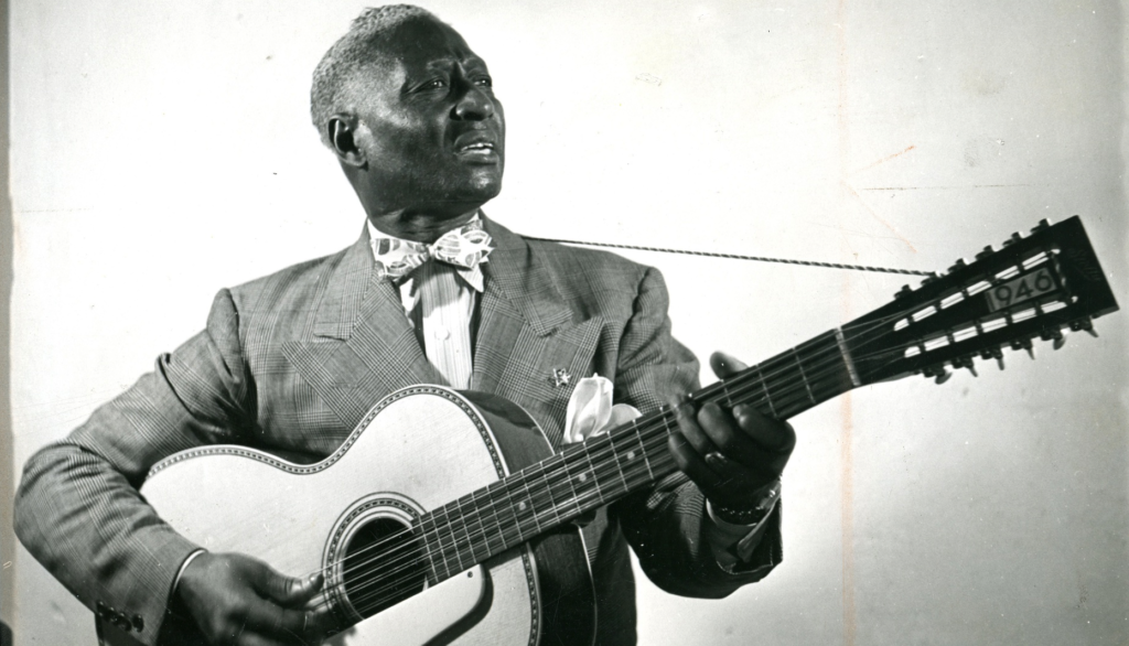
Build the official home for the estate of Huddie “Lead Belly” Ledbetter. The man George Harrison said made The Beatles possible. The man who first documented “stay woke” in American history. The man whose 12-string Stella guitar the Rock & Roll Hall of Fame put under glass.
It started as a website. The deeper we went, the clearer it became that a website without a strong identity would be a house without a foundation. You cannot build a digital heritage experience for one of the most important figures in American music history and stop at a color picker and a font choice. Brand identity. Website strategy. Merchandise. Archive framework. A complete visual world built to honor a legacy that had never had a home worthy of its weight.
That is the scope we accepted. That is the scope we delivered.
The Standard
This brand had to stand next to the Rock & Roll Hall of Fame. The Library of Congress. The Smithsonian. The Kennedy Center. It had to feel like it belonged in that company — because it does.
It also had to feel like it was made by family. People who carry his name and his blood and his story into every room they walk into.
Institutional but human. Most designers fall off that tightrope in one direction or the other. Too cold and it becomes a mausoleum. Too warm and it becomes a fan page.
We stayed on the rope.
The Research
We didn’t look at other brands.
We looked at a guitar.
Specifically, Huddie’s 12-string Stella — the largest Stella ever made, with extra heavy bracing, multicolor marquetry inlay, and a tailpiece that gave it a resonance most instruments could never touch. He named it. He played it until his hands gave out. This guitar once went to auction for $300,000. The Rock & Roll Hall of Fame put it under glass.
That guitar became the entire visual system.
The warm amber of its body became Stella — the brand’s anchor color. The iron-rich red clay of Angola Penitentiary’s soil — where his voice was first recorded in 1933 — became Angola. The near-black darkness of Fannin Street in Shreveport, where Huddie absorbed every musical tradition the Deep South had to offer inside dimly lit saloons and dance halls that barely let the light in past the doorways, became Fannin. The cool institutional slate of the Library of Congress that preserved him became Lomax. The deep navy of the sky outside a prison window at the hour when freedom is possible but not yet certain became Midnight — named for his most iconic song.
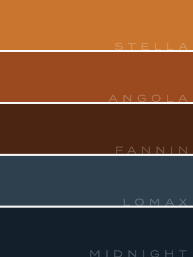
And the darkest color in the palette is named Scottsboro. (not pictured here)
After the nine Black teenagers falsely accused, sentenced to death, and imprisoned for a crime that never happened. After the sea of Black lives lost to a justice system that was never built for them. After the 1938 recording where Huddie looked directly into the microphone and said — for the first documented time in American history — “best stay woke, keep their eyes open.”
Black is the color of remembrance. Every name in this palette carries a place, a story, a life. We went that deep because Huddie’s story deserved to live inside every decision, not just on the surface of it.
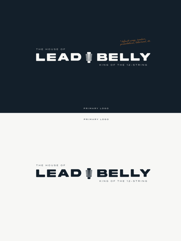
The Logo
Five versions. One system. Each one earning its place.
The piece that defines all of it is the brand mark — and the story of how it got there is worth telling.
It didn’t start as a 12-string headstock. We explored other directions. Then the research kept returning to the same truth: Huddie didn’t just play guitar. He played a specific guitar. He called himself the King of the 12-String Guitar. Not the King of the Blues. Not the King of Folk. The King of the 12-String. A declaration of mastery over something most musicians never attempted.
A generic guitar silhouette would have told the wrong story entirely. Millions of musicians play six-string guitars.
The 12-string guitar has a headstock unlike anything else in American music. Twelve tuning pegs — two for every string — creating a visual density that is wider, fuller, more complex, more powerful. When you isolate that headstock and render it as a mark, it reads as ancient and modern simultaneously. It has symmetry and gravity. And because most people have never stopped to look at what a 12-string headstock actually looks like, the mark carries an intrinsic curiosity. People lean in.
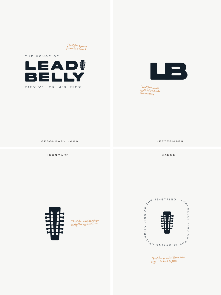
Some people, when they first saw it, thought it was a microphone.
Sit with that.
A microphone is a symbol of voice — of sound transmitted, of a person speaking to the world. Two people independently saw this mark and felt voice before they understood instrument. In a brand built around a man whose voice literally changed the course of American music, that is the mark doing its deepest work.
The headstock is specific. The headstock is him. The 12-string headstock represents one man and one man only.
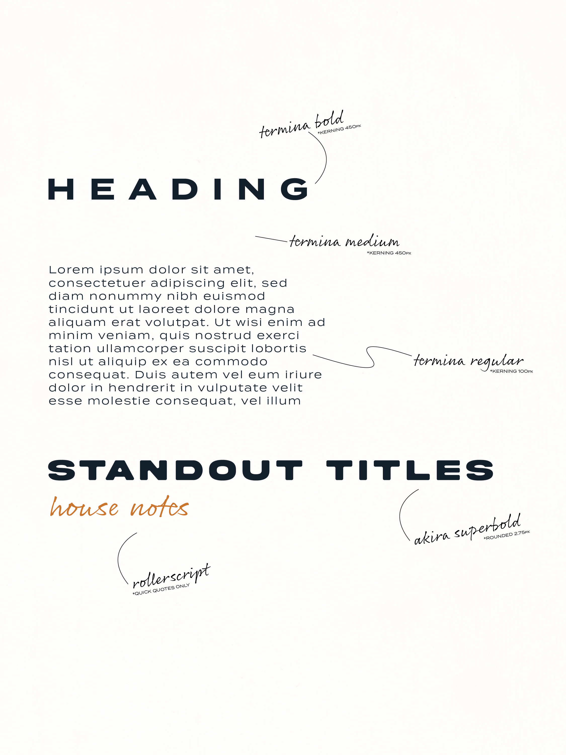
The Typography
Termina Bold for headings. Wide. Commanding. Built to carry weight.
During the research, we pulled up the 1976 Gordon Parks film Leadbelly. The title cards in that film: bold, condensed, all caps, tracked wide. The same letterform character as Termina Bold. We didn’t plan that connection. The research found it. That is what happens when you go deep enough — the work starts connecting itself.
Akira Superbold for standout titles. Loud and unapologetic. Rollerscript for pull quotes — the handwritten voice, personal and close, the way Huddie actually spoke between songs when he was explaining where the music came from.
The system has range because Huddie had range. He wrote children’s songs and political indictments and protest music and love songs and prison ballads. The typography holds all of it.
The System
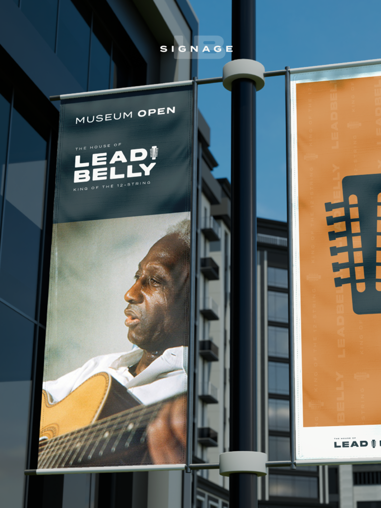
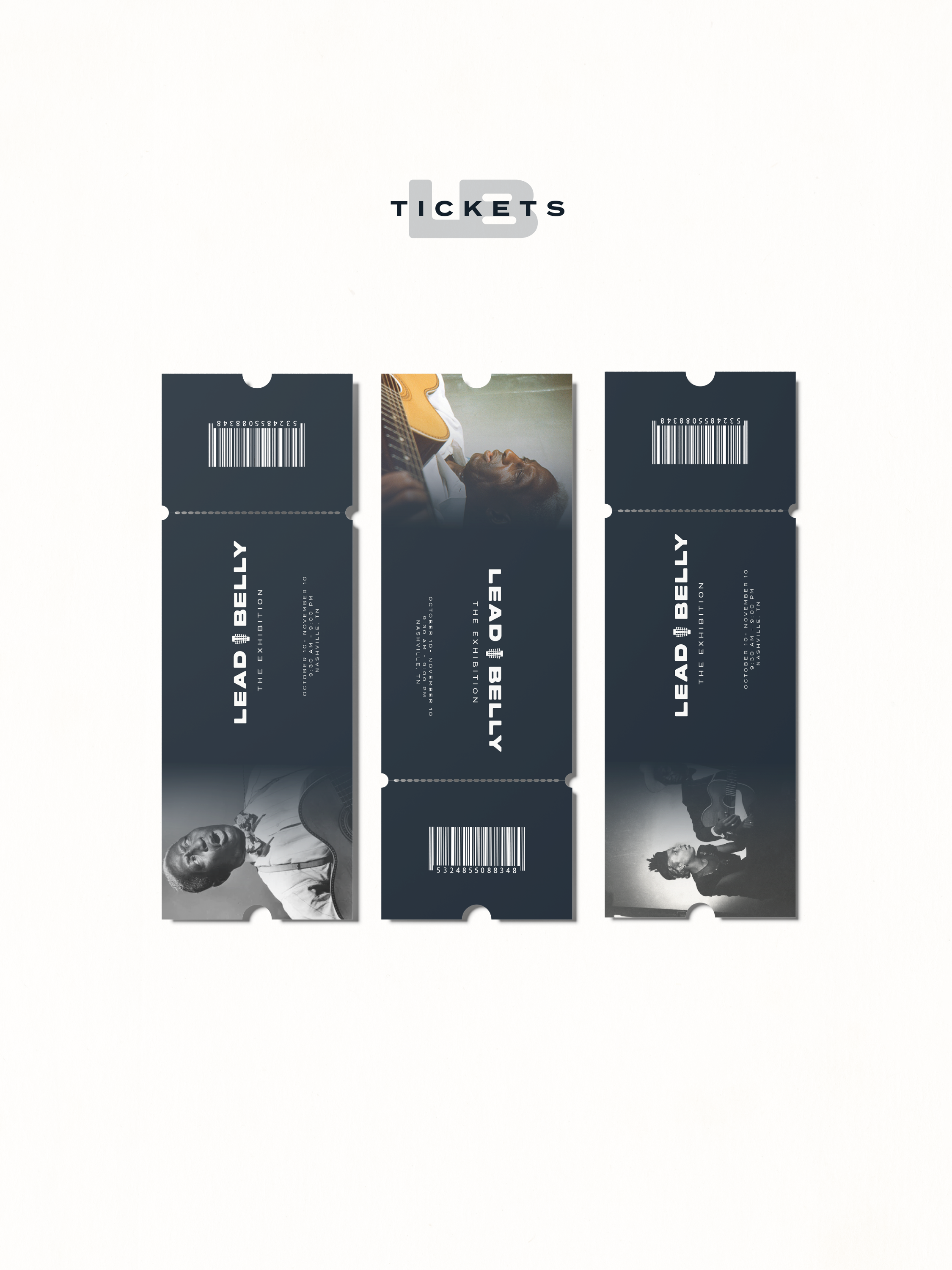
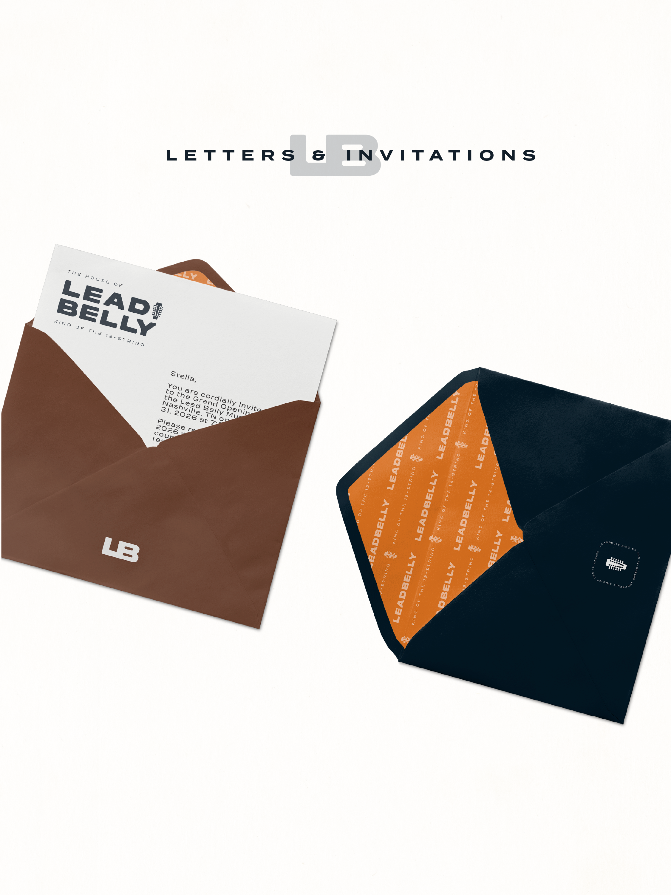
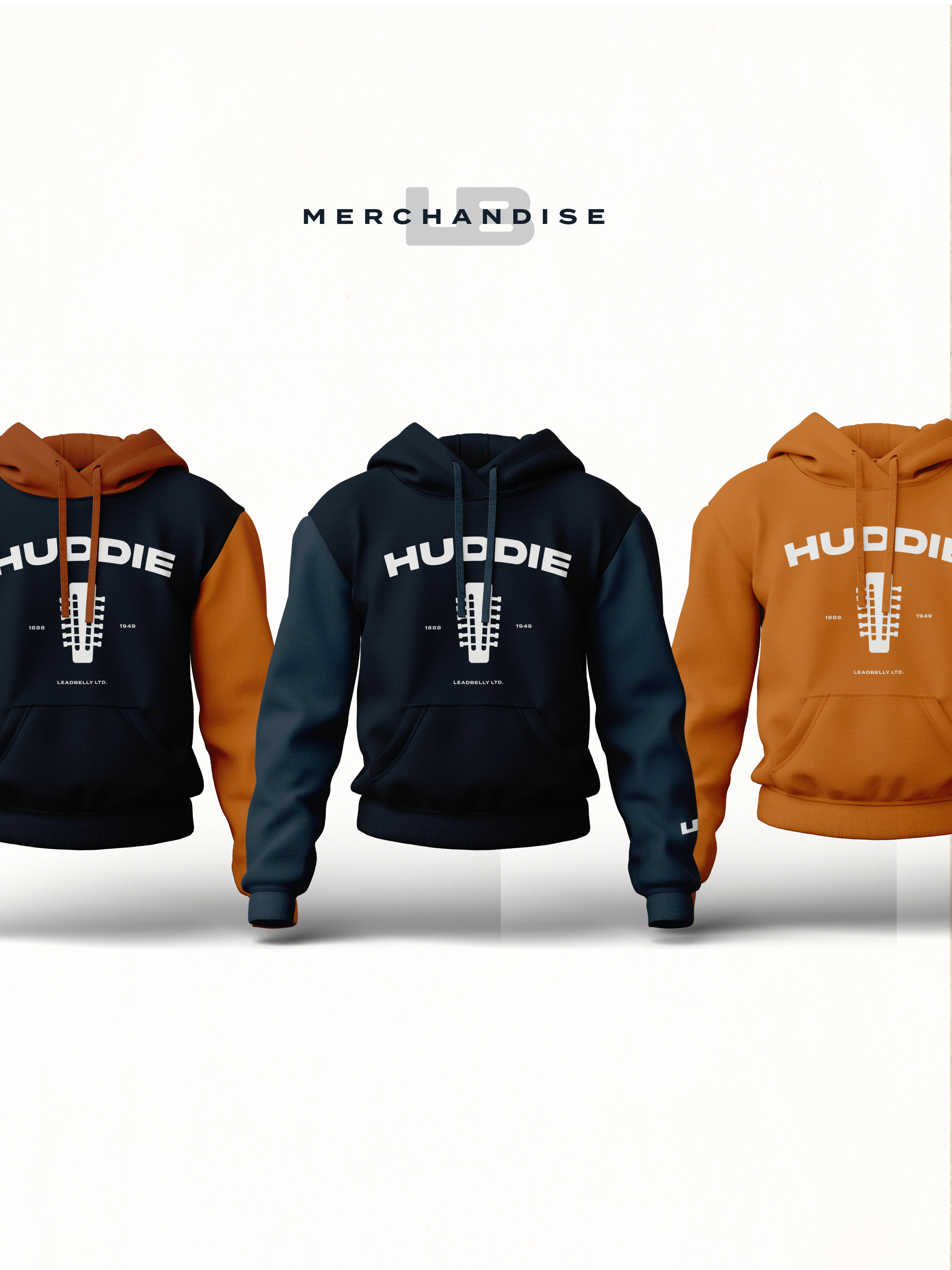
Five logo versions. A named color palette rooted in real places and real history. A typography system with five typefaces that each serve a distinct voice. A brand pattern built from the name, the mark, and the title. A website framework. Exhibition signage. Museum banner flags. Event tickets. Invitations with patterned liners. A merchandise line anchored by the HUDDIE hoodie — his name in Termina Bold, the guitar head mark centered on the chest, 1888–1949, LEADBELLY LTD. at the hem.
This brand lives on a screen. It lives on a wall. It lives on a body.
The Outcome
The family saw it. There was back and forth — as there should be when the stakes are this high and the name belongs to someone’s blood. Every refinement made it stronger.
What you are looking at is a brand that can stand outside a museum, anchor a documentary, sit on the shelves of the Smithsonian, and live on a hoodie — without ever losing the feeling that it was made by people who understood what they were holding.
Huddie Ledbetter spent his life making music that outlasted everything the world threw at him.
This brand was built to do the same.
Brand identity, website strategy, merchandise, and archive framework by Villainus.
Leave a Reply